Rich Messaging
Quick Replies
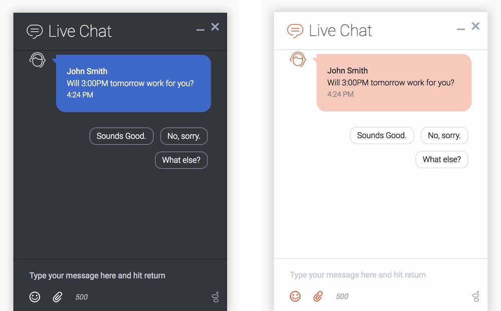
Quick Replies offer the customer a choice of responses to the last agent or last chat bot message in the transcript. Tapping or clicking one of these Quick Replies posts that reply back to the agent as a text message. This saves the customer from having to type a response manually.
Quick Replies are very flexible. A chat bot or agent can provide context-sensitive quick replies that aid in making a selection, polite responses (such as "OK", "Thank you", "Yes, please" in the customer's native language), numeric responses, or choose from a set of preset time slots.
JSON Examples
Quick Replies are attached to standard chat message objects by adding a few additional properties:
- type - The type of message object received. For quick replies, the value will be "Message".
- contentType - The type of rich message content attached to the message. For quick replies, the value will be "quick-replies".
- content - An array of rich message content and other attachments. For quick replies, this will contain quick reply objects.
Top level of message object
Note, this example is only showing properties related to quick replies. All other properties normally included inside a message object have been omitted.
{
    "type": "Message",
    "contentType": "quick-replies",

    "messageType": "text",
    "text": "Will 3:00PM tomorrow work for you?",

    "content": [

        {"id": 1, "type": "quick-reply", "action": "message","text": "Sounds Good."},
        {"id": 2, "type": "quick-reply", "action": "message","text": "No, sorry."},
        {"id": 3, "type": "quick-reply", "action": "message","text": "What else?"}
    ]
}
Generic Template
The Generic Templates allow you to craft custom cards with an array of different components like buttons, link, and text.
You may craft your generic templates in many different ways by adding or omitting any property or component. This affords you great flexibility to build your generic templates they way you want.
Template Structure
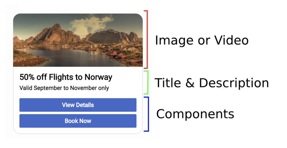
The structure of the generic template is a simple stack. If you omit any of the content, the stack will collapse that space. This gives you the option to use the generic template for showing single elements. This could be as simple as an image or video by itself, a single button or group of buttons, or just text.
Clickable Areas
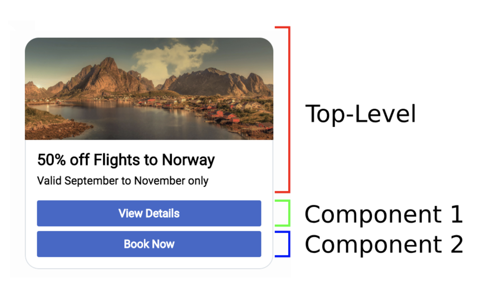
The generic template is divided into clickable areas, each having it's own actions defined. The main top-level of the structure allows you to click on the image, title, or description to trigger its action. Each component has its own actions.
JSON Examples
Generic Templates are attached to standard chat message objects by adding a few additional properties:
- type - The type of message object received. For generic templates, the value will be "Structured".
- contentType - The type of rich message content attached to the message. For generic templates, the value will be "generic".
- content - An array of rich message content and other attachments. For generic templates, this will contain generic template objects.
Top level of message object
Note, this example is only showing properties related to generic templates. All other properties normally included inside a message object have been omitted.
{
    "type": "Structured",
    "contentType": "generic",

    "messageType": "text",
    "text": "",

    "content": [

        {
            "id": "987a6c84-ada0-468f-86e1-e9ea715b8c32",
            "title": "50% off Flights to Norway",
            "desc": "Valid September to November only",

            "image": "http://www.samplesite.com/flights/img/norway_promo.jpg",
            "video": "",

            "actions": {

                "url": "http://www.samplesite.com/flights/norway",
                "urlTarget": "__BLANK"
            },

            "components": [

                {
                    "id": "0",
                    "type": "button",
                    "text": "View Details",
                    "title": "View Details",
                    "actions": {

                        "url": "http://www.samplesite.com/flights/norway",
                        "urlTarget": "__BLANK"
                    }
                },

                {
                    "id": "1",
                    "type": "button",
                    "text": "Book Now",
                    "title": "Book Now",
                    "actions": {

                        "url": "http://www.samplesite.com/flights/norway/book",
                        "urlTarget": "__BLANK"
                    }
                }
            ]
        }
    ]
}
JSON Reference
Top-Level of content object
| Option | Type | Description |
|---|---|---|
| id | string | An ID assigned to this structured message instance. Each instance inside the 'content' array will have a unique ID. |
| image | image file URI | Path or URI to an image file. The image will scale to fit the width of the structured message while constraining its aspect ratio. Also used as the video placeholder if both 'image' and 'video' are set. |
| video | video file URI | Path or URI to a video file. Support is determined by browser. MP4 files are generally supported by all browsers. The video will scale to fit the width of the structured message while constraining its aspect ratio. If the 'image' property is also set, that image will be used as the placeholder or 'poster' for the video. |
| title | string | Text to show in the title row. |
| desc | string | Text to show in the description row. This is immediately below the title. |
| actions | object | An object containing properties that define the actions that will be executed when you click on this area or element. |
| styles | object | An object containing style properties that define the look and feel of this area or element. |
| components | array | An array of component objects. Componenets are stacked in the order defined by this array. Each component can have unique properties. Refer to each component's JSON structure. |
Button Component
| Option | Type | Description |
|---|---|---|
| id | string | An ID assigned to this component. Component IDs are for reference only and can be assigned any value. |
| type | string | The type of component to render. To render a button, the value must be 'button'. |
| text | string | Text to show inside the button. |
| title | string | Tooltip text to show when hovering over the button. |
| actions | object | An object containing properties that define the actions that will be executed when you click on this area or element. |
| styles | object | An object containing style properties that define the look and feel of this area or element. |
Actions
Rich Messages allow you to configure actions to be perform when certain elements are clicked. The following actions are supported:
- Open a URL and set the target window
- Send a text response back through the transcript
- Send a postback data payload
- Execute a CXBus command and pass options to that command
"actions": {

    "url": "http://www.samplesite.com/flights/norway",
    "urlTarget": "__BLANK",
    "textback": "User Clicked on Link",
    "postback": {},
    "commandName": "SendMessage.open",
    "commandOptions": {"form": {"firstname": "john", "lastname": "smith", "email": "john@smith.com"}}
}
All actions are optional and all actions will be executed simultaneously.
You may define actions for the top-level of a structured message, i.e. the main image, title, and description, and you may define unique actions for each component inside your components array. This allows you to create a stack of buttons that each perform different actions when clicked.
Open URLs
One of the most common and simple actions is to open a link in a new window.
"actions": {

    "url": "http://www.samplesite.com/flights/norway",
    "urlTarget": "__BLANK"
}
You can control the target window or tab by specifying the target in the "urlTarget". This is applied to the link element's "target" attribute. The default target is "__BLANK", which will open a new window or tab.
Textback
Another common action will be to send a message back to the agent through the transcript.
"actions": {

    "textback": "I clicked the Norway link"
}
This will post a message as if the user had typed it. This functions much like quick replies.
Postback
Sometimes you want to send some data back to the agent or chatbot. This can be any kind of arbitrary data like a form submission, timestamps, state changes, and other data that might help the agent or chatbot understand the user's selection and interaction inside the structured message. Data you postback is linked to the Structured Message ID.
"actions": {

    "postback": "{}"
}
Commands
You can trigger client-side commands to help the user open other widgets or run custom commands you've created on your website.
"actions": {

    "commandName": "SendMessage.open",
    "commandOptions": {"form": {"firstname": "john", "lastname": "smith", "email": "john@smith.com"}}
}
Commands are executed by name and you can pass in an object with properties known as "options". These options control the command in the same way arguments control a function call.
An example scenario might go as follows:
- A user starts a chat and while he is waiting for an agent, a chatbot queries the user
- If no agents will be available, or if it is after hours, the chatbot can send a Generic Template with a button offering the user to send an email instead
- If the user clicks the button, the SendMessage widget will open next to the WebChat widget.
- This has assisted the customer in using Genesys Widgets based on situation the chatbot identified.
Styles
You may apply unique CSS styles to certain elements through the use of the "styles" object. This object can be included at the top-level of the structured message and inside each individual component to control styling.
Styling is limited to a subset of CSS properties
"styles": {

    // Default styles
    "background-color": "#000000",
    "align": "left",
    "color": "#FFFFFF",
    "border-radius": "15px",
    "border": "1px solid black",
    "font-weight": "bold",
    "font-style": "italic",
    "text-decoration": "underline",
    "bold ": true,
    "italic ": true,
    "underline ": true

    // Alternate mouse hover styles
    "background-color-hover": "#FFFFFF",
    "align-hover": "left",
    "color-hover": "#000000",
    "border-radius-hover": "5px",
    "border-hover": "5px solid #FF0000",
    "font-weight-hover": "bold",
    "font-style-hover": "italic",
    "text-decoration-hover": "underline",
    "bold-hover": true,
    "italic-hover": true,
    "underline-hover": true
}
Style properties are separated into two groups: Default and Hover. Default styles are applied to elements immediately while hover styles are applied only when a mouse is hovering over the element. The only difference in property names is that hover properties are appended with "-hover".
Not all elements support all styles. Elements are assigned a Style Group that controls which styles can be applied. For instance, a "title" element contains only text, so styles pertaining to border styles are not allowed, only text styles are allowed. These limitations are imposed to make styling easier while maintaining the overall look and feel of the structured message.


