Visual Standards
Contents
This page will help get you started with Snagit and describe the standards we are using for adding visual enhancements to your images. Use them as a foundation to help maintain a consistent look and feel within the docs.
Icons
To maintain visual coherence with marketing and sales, use the icons from the linked PowerPoint (Genesys Presentation Corporate Icons) on the Genesys Branding Tools page.
Basic guidelines
The cloud template requires at least one image (or video) to accompany your text. The image is often going to be the first thing the reader sees, so we want it to be useful and not just a generic screen shot. The goal is for the reader to easily scan your image and understand the task at hand.
We want to reduce the need for “click this, click that” procedural text. The graphic and the text should complement each other, not just repeat the same info. Here's an example of how that might work:
[+] Example: Making graphics and text work together
Here are a few things to keep in mind when planning your images:
General
- Do not use thumbnails or captions. Images are uploaded full-size and are re-sized by the template.
- Use black for your markup (callouts, arrows, circles, etc). If the native image (UI, line drawing, etc) contains color, that is fine.
Visual grammar
- Think of your image or video as another narrative tool.
- What can you tell the reader by just showing them an image?
Simplicity
- Keep it as simple as you can. Avoid cluttering your image with too much detail. To the user, an overly busy graphic is like a wall of dense text. (They will just skip it.)
- Focus on the main idea, or the details you feel are most important. You do not need to show every step or movement of a task. Maybe just show the final step, or the trickiest one, and let the text carry the rest.
- Use markup sparingly. If it is easy to see the Save button, there is no need to circle it or point to it with an arrow. Use markup for elements that aren't easy to spot, such as a radio button in a sea of other radio buttons, or a checkbox in the bottom corner. You can also use the UI to help draw attention to menu items and active tabs by having them selected in your capture.
Setting up Snagit
Don't have Snagit? See Lorraine about getting a license.
Snagit is easy. We’ve even pre-built some custom stamps and arrows that you can use to add meaningful things to your screenshots. The video will show you how to add these to Snagit, or you can follow these steps:
- Get the custom stamps and samples file.
- Under the Stamps folder in the Snagit installation directory, create a folder called Genesys and extract or copy the the *.png files to it. Note: You might need to have administrator rights to add or extract files to the installation folder.
The custom circles and numbers are automatically added to the Stamps QuickStyles. For the Arrows:
- Open one of the sample *.snag files included with the zip file. Right-click any of the arrows and select Add to Quick Styles.
You can now click the Stamp tool and browse to Genesys to use the custom stamps, or click the Arrow tool to select the custom-styled arrow from your Quick Styles.
Snagit Tips and Tricks
- You can stop Snagit from automatically expanding the canvas when you move an object near the edge of the canvas. Just click File > Editor Preferences – then on the Editor tab, clear the Automatically expand the canvas to fit objects checkbox.
- ALWAYS save your work as a *.SNAG file first before saving the *.PNG version. This makes it easy to make changes later.
- After you have defined a style for an effect (like for the wave edge effect), you can add it to your personal library of Quick Styles. Depending on the effect, you can either right-click and select Add to Quick Styles, or save it to your Quick Styles while adjusting the effect settings.
- Need whitespace? Expand the background canvas by pulling the square handles around the edges of your image.
- If you've captured an image to the clipboard, add it to the Snagit editor by selecting File > New from clipboard.
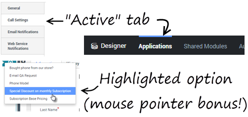
- Capturing a UI? Use the interface as another way to highlight menu items, tabs, text to enter, or options to select. For example, be on the active tab, select the target option, or mouseover the target menu item before capturing the screen. Paths appearing in the UI are also useful.
[+] Example: Active tabs and highlighted menu options
- Want to share a capture of the Snagit UI itself? If pressing Fn + PrntScrn immediately minimizes the Snagit Editor, you'll need to open the Snagit 13 Capture tool (ie: not the Editor) an then select File > Capture Preferences... then click the Capture tab and uncheck "Hide Snagit when capturing". This allows you to grab a capture of the Snagit UI.
Adding callout text
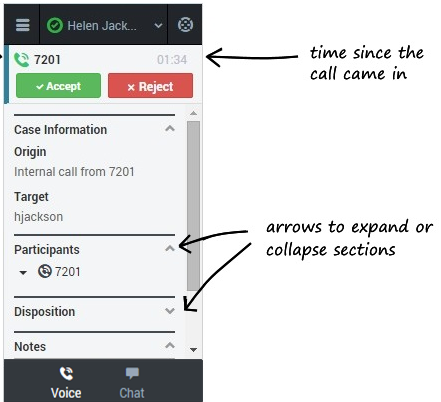
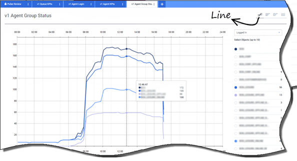
Callouts are a great way to tell the reader something about what they are looking at. For example, “Here's the file you uploaded” or “Don’t forget this”. Use in combination with a border-free callout box.
- Use the SEGOE PRINT font in Snagit. This style stands out from the UI and is meant to simulate a marker-on-a-whiteboard effect.
- The wiki will re-size your images, so try to use a large font size to allow for some shrinkage. (36-point seems to work well.)
- We're not just labeling, we're talking. For example, instead of saying "Send button", say "Send your message".
- Try to avoid using callouts to label obvious things or repeat what is already in the text. For example, you don’t need to point at a Save button and say “Click here to save”.
- Be concise. Instead of saying "When you are finished, click here to send the file", say "Send the file".
Wave edging
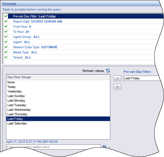
Use this when cropping a section of a larger screen. It tells the reader there is more to the image, but they don’t need to see it right now.
- To apply it, go to Image > Edges > Wave Edge Options.
- Use an effect-size around 8 and remove any drop-shadow.
- Select Add to Quick Styles to have it ready for next time.
Circling (custom oval stamps)
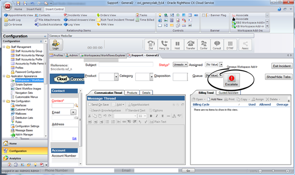
The custom oval stamp can be re-sized and stretched to satisfy the most discriminating of item circlers.
- Circle things that might not be obvious. You do not need to circle things that the reader can easily see or figure out. Most will already know about Apply, Save, or Next buttons. They might not easily notice the tiny checkbox in the corner.
- Use them to focus reader attention on an important (or interesting) element or detail, not the generic stuff.
 Go easy. Too much circling can quickly cause clutter.
Spotlight and magnify
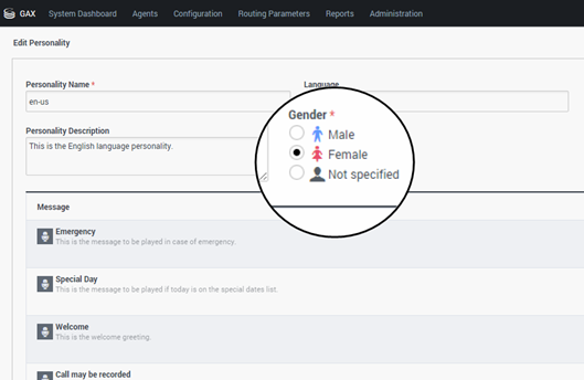
Sometimes you need to show a full-screen, but want to focus attention on a particular detail. Use the Spotlight and Magnify tool to create a magnifying glass effect.
- We use a two-step process for this tool: First, we apply the effect. Then we use the shape tool (circle) to add a black border around it. (Watch the demo at left.)
Blurring
Your capture might contain confidential or sensitive information that belongs to actual customers. This information must be obscured to prevent any legal troubles or breaches of privacy.
- Select a section of the image and apply the tool, using an amount of blur that looks right for the situation. You can blur a large area, or select more specific portions.
Numbering (custom number stamps)
The original idea behind using the numbering stamps was to show an order to a multilayered flow or sequence, not to correspond with procedural steps in the text. But this is how most people seem to interpret them.
 We recommend these be used sparingly, if at all.
- Too many number stamps can be distracting, especially if they are not visually in order.
- Instead of numbering, maybe try an alternative. Layers can be arranged to convey a logical order (overlapping, stacked in descending order, etc). Otherwise, maybe it's best to let the text specify the order of the flow.
Adding layers
Sometimes you want to combine several captures into one image flow. You can do this by adding them as layers to an existing image or background.
- Create a new image in Snagit using a large canvas size (such as 1200 x1200) and a transparent background.
- Capture (or open) your images in Snagit and apply any cropping or edge effects you want to them. Tip: It's usually best to wait until you have arranged the images on the new canvas to add arrows and text callouts.
- Copy and paste each image onto the canvas and arrange as needed, adding any additional callouts or visual enhancements.
- Trim the extra whitespace.


