Interface Overview
Contents
Note: The minimum screen resolution for Composer is 1024x768 on a standard 4:3 aspect ratio monitor. The recommended resolution is 1280x1024. Lesser resolutions, such as 800x600, are not supported.
Tutorials
For a tutorial on voice applications, see Your First Application, which describes a text-to-speech application. For a tutorial on routing applications, see Your First Application, which describes a DNIS routing application.
Blocks, Connectors, and Properties
The Composer interface uses workflow and callflow design components (blocks and connectors) to create voice and routing applications.

It uses drag-and-drop to arrange, add, and delete blocks on a canvas area. The blocks are connected within the canvas (work area ) to build the flow for the application. You define the properties for a selected block in Composer's Properties view. Also see: Working With Diagram Layouts
Interface Elements
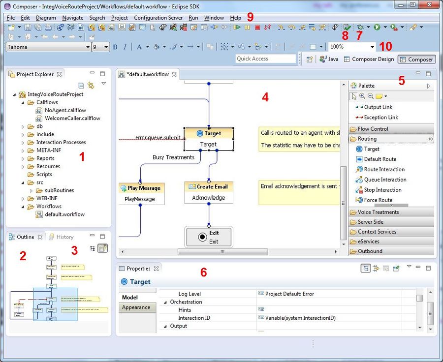
The first time you enter the Composer perspective, since your workspace is empty and does not contain any Projects, you will see an empty Project Explorer on your top-left, and a blank center area. After you create a voice or routing Project, the Package Explorer shows all the files and resources that make up the Project. The figure below shows the GUI elements in Composer perspective for a sample routing application.
GUI Element Descriptions
The numbers in the figure above are keyed to the table below.
| 1 | The Package Explorer shows all the files and resources that make up a Project. See Composer Projects and Directories for more information. |
| 2 | For large flows, the Outline view (shown above) allows you to navigate to the portion of the flow to view in the main canvas. |
| 3 | The History view maintains previous versions of flows and application files, allowing you to revert to any previous version if needed. |
| 4 | The Canvas is where you create flows by placing and connecting blocks. Composer's canvas area is the overall workplace that you will use for building your applications. |
| 5 | Depending on your Perspective, the Palette contains workflow diagram-building blocks or callflow diagram-building blocks grouped in various categories. |
| 6 | The Properties view shows block properties and allows you to modify settings, set variables, and otherwise change or set the properties corresponding to a block. This area also displays Call Traces during debugging, or Problems during validation or testing. |
| 7,8 | In the top toolbar, the Validate button allows you to check for syntax errors. The Generate Code button creates VXML and SCXML pages from the diagrams you create. |
| 9 | Menus and Toolbars provide commands and operations for running Composer. |
| 10 | Perspective buttons show the active perspective and let you easily move between perspectives. By default, when you enter the workbench for the first time, you will be taken inside the Composer perspective. Perspectives are arrangements of different sections of the GUI in a manner that facilitates easy use of a particular feature. For example, the GVP and ORS Debugging perspectives will show those sections (Breakpoints, Call Trace, Variables, and so on) that are useful when debugging an application. |
Composer displays a Help view on the right if you select Help > Search or Help > Dynamic Help.
Perspectives
Composer includes the following perspectives for building applications:
- GVP Debugger, for debugging applications you build or import
- ORS Debugger, for debugging routing applications you build or import
- Prompts Manager perspective, which provides the ability to quickly review all prompts in a Composer Project
- Composer perspective shows the Project Explorer, Outline view, Canvas, Palette, and can show the following tabs in the lower pane: Properties, Prompts Manager, Problems, Console, and Call Trace.
- Composer Design perspective can be used to simplify the workbench to show only the palette of blocks, the canvas area, and the Properties tab.
When you click the open perspective button and select Other, the window lists all perspectives available in Eclipse. You can use this window to change perspectives or select Window > Open Perspective. Any customized perspective appears in this list. You can configure perspectives on the Window > Preferences > General > Perspectives preference page.
Customizing the Show View Menu
A view can be displayed by selecting it from the Window > Show View menu. You can customize this menu by using Window > Customize Perspective. Click the Submenus down arrow and select Show View.

